
In order to make sure that your website works perfectly on all devices, you must Test Your Website Responsiveness regularly. With the increasing use of smart devices, and more devices being introduced into the market almost regularly, it is very important that the website owned by you or the one you are going to develop is rendered properly on all devices without any horizontal scrolling or random crash.
When you use WordPress as CMS for your website, I suggest you Genesis themes. Because all Genesis themes are responsive themes. It is also recommended to use the AMP version for the mobile website instead of the responsive theme. Because Google gives priority to AMP websites in their search results.
It is impossible to test your website manually on all devices, especially if the budget allotted for testing is short. There are various tools, however, that help the user to test the responsiveness of a website. In this article, we shall discuss 13 such tools that make responsiveness testing easier.
Best Tools to Test Your Website Responsiveness
1. Responsinator
Responsinator is a free tool that is browser-based. The user only has to enter the URL of the site that he needs to test and it does its job by portraying how the site is rendered in different browsers of different shapes and sizes. Not only that, but you can also interact on the website by clicking a button or navigating through the pages.
Highlights of Responsinator
- Simple Interface
- Easy-to-use
- Provides results in a very short time
- This is completely free to use
2. LambdaTest

Lambdatest main purpose is to provide a solution for cross-browser compatibility testing, it also offers website testing on multiple devices of different dimensions and resolutions. The tool is cloud-based and provides accurate results. It has premium plans.
Highlights of Lambdatest
- Advanced Dashboard
- Ultrafast Automation Testing Grid
- Live-Interactive Browser Testing
- Real Device App Testing
- 120+ Integrations
3. Screenfly
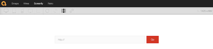
Screenfly also performs in the same manner as responsinator. The user has to carry on testing after entering the URL in the toolbar. The reason behind the immense popularity of this tool is that it’s one of the oldest in the market.
Highlights of Screenfly
- Open-source tool
- Easy-to-use
- Provides resolutions of various devices
- It allows testing for custom screen size too
- RELATED – 2 Ways to add Google Analytics to AMP pages
- 4 Ways to Perform Google AMP test for validation errors
4. Chrome Dev Tools

Chrome Dev Tools is a device mode in the developer console of Google Chrome. Users can choose all the popular devices and take a look at how their websites function on the emulated device. Apart from popular devices it also offers a responsive breakpoint as well.
Highlights of Chrome DevTools
- Built-in Tool
- Supports Command and shortcuts
- Remote Debugging
- Accessibility
5. Ghostlab
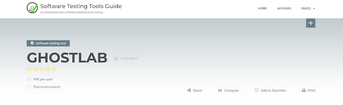
Ghostlab is a paid tool that allows users to test their websites simultaneously across different devices as well as browsers. Once the user starts testing on one of the platforms, the other platforms also replicate the same action.
Highlights of Ghostlab
- Easy-to-use
- Supports Windows and Mac operating System
- Available in Web platform
6. BrowserStack
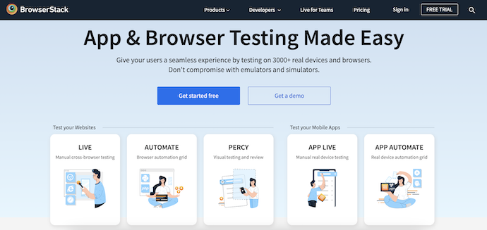
BrowserStack is one of the most advanced testing tools available in the market which can Test Your Website’s Responsiveness. BrowserStack is a paid tool that offers to test the responsiveness of a website across thousands of devices, each with its own resolutions. The tool is constantly being updated with the release of each new browser or device. Organizations like Microsoft, Airbnb, and Twitter are renowned customers of BrowserStack.
Highlights of BrowserStack
- Trusted by 50,000 customers across the globe
- Allows to test your website and Mobile Apps
- Instant access to 3000+ browsers and real iOS and Android devices.
- Uncompromising Security
7. Cross-Browser Testing
Cross-Browser Testing supports the testing of a website across multiple devices. As the name suggests, the main purpose of this cloud-based testing tool is to test the responsiveness of a website. This all-in-one platform offers almost 1500 different devices and browsers on which testing can be done simultaneously, compare screenshots and look at how your website feels on not an emulator, but a real-world device.
Highlights of Cross-Browser Testing
- No lab mintainance required
- More flexible testing tool
- Allows to integrate into your automation workflow
8. Am I Responsive

Am I Responsive is a simple and easy-to-use tool that provides a feature where the user can click and drag on a virtual device and test their websites across it. Not only that but if you save it on your bookmark, you can run the tests directly from there.
Highlights of Am I Responsive
- Simple Interface
- Easy-to-use
- It displays multiple views in a single page
9. Mobile Browser Emulator

Mobile Browser Emulator is another plug-in just like Ripple available at the Chrome web store. Just by visiting the website and clicking on the plugin, the user gets a view of what it will look like on a real device. However, there is one drawback. This emulator does not contain all the devices and resolutions. Only some basic resolutions are available.
Highlights of Mobile Browser Emulator
- Free Extension
- Create screencasts in GIF format
- Provides 48 devices to test resposiveness
- Night Mode Available
10. Responsive Design Checker
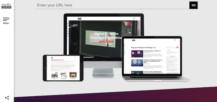
Responsive Design Checker is not a tool but an online platform that acts like all the others mentioned above. Apart from popular devices, the user can also test customized resolutions on this platform and share the results via social media.
The tools mentioned above are excellent for testing whether your site is responsive or not. However, it should be kept in mind that there are so many emulators that can replace the test results observed in a real device. Still, when budget and time are short, these tools are great to serve the purpose. We suggest you go with LambdaTest.
Highlights of Responsive Design Checker
- Free-to-use
- Simple interface
- Easy to choose the resolution
Conclusion
Responsiveness is very important for every website to make it compatible with devices of different resolutions. So that, users can browse the website without the content overflow. While creating a webpage, the programmer has to check for the responsiveness of the website. Visit and try the tools discussed in the above article to check whether your website is Responsive or not.
I hope this tutorial helped you to set up the “Best Tools to Test Your Website Responsiveness“ feature. If you like this article, please share it with your friends. If you want more blogging tips, follow BlogVwant on Facebook, Twitter, and YouTube.
Best Tools to Test Your Website Responsiveness – FAQs
What is the best tool to check website responsiveness?
BrowserStack’s Responsive Tool allows a user to instantly test a website for responsiveness across various devices just by entering the website’s URL in the designated space.
What is the best browser to test responsive web design?
Chrome Developers Tools is the best browser to test responsive web design. This is the go-to tool for developers to test and debug responsive websites. The tool simulates a range of mobile screen sizes and orientations to help you see how the layout and elements adapt to different viewports, find and fix errors quickly, and see the changes in real-time.
What is the alternative to Amireponsive?
The best alternatives to Am I Responsive are Responsive Viewer, Multi Screen Test, and W3C Mobile Checker.
What is the responsive tool?
Responsive Test Tool is like most responsive testing websites, you can input the URL of the page you want to test into a search bar on the top of the screen.
What is the best language for a responsive website?
Responsive web design makes your web page look good on all devices. Responsive web design uses only HTML and CSS.